The short version
- Great UGC app ads show the app on screen in the first seconds, not after a long intro.
- Pair screen recordings with face-cam so viewers see both the product and a real person using it.
- Choose the format by goal: demos explain, skits earn attention, reviews build trust.
- Show a real, specific outcome, and keep claims within what the app actually does, especially for finance apps.
Apps are one of my favourite things to make UGC for. I'm Mimi, a Toronto-based creator, and alongside beauty and wellness I make creator videos for tech and app brands in the US and Canada, from productivity tools to finance apps to mobile games.
App ads have one job: get someone to tap download. That's a different job from selling a moisturizer, and it needs a different playbook. Here's how I approach UGC for mobile apps, with real examples from my portfolio.
Why UGC works for app install ads
An app is invisible until someone opens it. You can't hold it up to the camera or swatch it on your arm. UGC solves that by showing a real person using the app in a real moment of their day.
The viewer isn't thinking "what does this app do?" She's thinking "would this fix my thing?" A creator video answers that faster than a feature list ever could.
Show the app in the first seconds
The most common mistake I see in app install ads on TikTok is a long talking intro before the app appears. By the time the screen shows up, the viewer is gone.
My rule: the app, or the problem it solves, is visible almost immediately. That can be:
- The phone in hand with the app open as I start talking.
- A screen recording as the first shot, with my voice over it.
- A visual of the problem, then a hard cut to the app solving it.
Here's how I did it for Motion, an AI calendar and productivity app. The hook uses thought bubbles to show that overwhelmed, too-much-in-my-head feeling, and the app comes in as the answer.
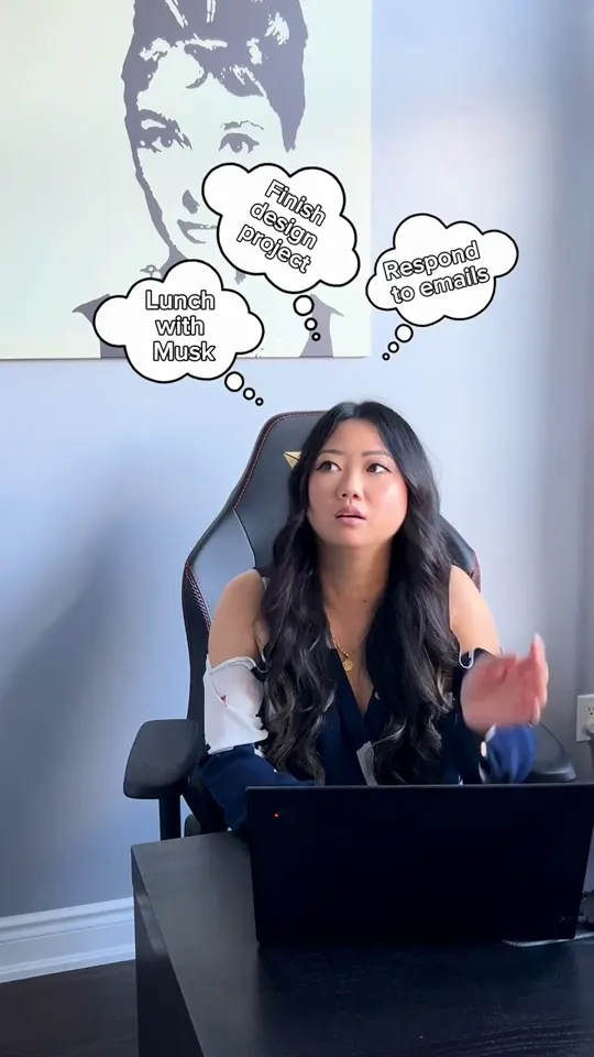
Motion's Creative Lead said it better than I could: "Mimi was SO fast, SOOOO creative and hilarious, very professional, the ads she made were 10/10!"
Screen recording plus face-cam
The strongest app demo video UGC usually combines two things:
- The screen, so viewers see the actual interface and how simple it is.
- My face, so there's a person they trust explaining why it matters.
A few ways I combine them:
- Green screen style: I'm in the corner reacting while the screen recording fills the frame.
- Cutaways: I talk to camera, then cut to a clean screen recording of one specific feature, then back to me.
- Over-the-shoulder: the phone in my hand, filmed so the screen is readable.
What I ask from app brands: a test account with realistic sample data, the exact flows you want shown, and anything that should stay off screen. Clean, believable screens make a huge difference. A demo account full of placeholder text looks fake instantly.
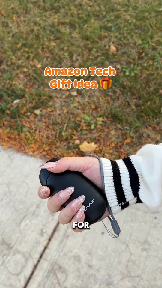
The same demo principles carry over to tech products, like this Amazon tech product demo.
Skit vs demo vs review for apps
Different formats do different jobs. Here's how I think about them for apps:
| Format | Best for | Watch out for |
|---|---|---|
| Demo | Explaining how the app works | Too many features in one video |
| Skit | Stopping the scroll and earning shares | The app becoming an afterthought |
| Review | Building trust and answering objections | Sounding scripted |
Skits
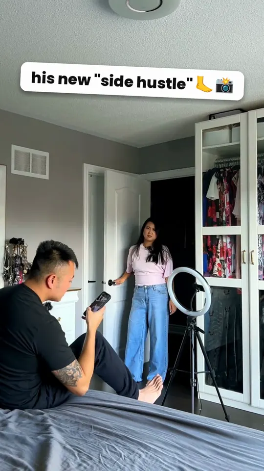
Skits are where I get to have fun. For Bree, a finance app, I made a couple skit built around a "his new side hustle" hook. The relatable relationship moment grabs attention, and the app slides in as part of the story.
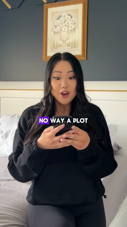
For a manga reader app, the hook opens on "no way a plot..." and plays on the reaction every reader knows. Skits like this work best when the joke and the app's purpose are tied together.
Demos
Demos are your workhorse. They answer "how does it work?" and are usually the best first video for a new app. Keep one demo focused on one feature or one use case. Need to show five features? That's five videos, not one.
Reviews
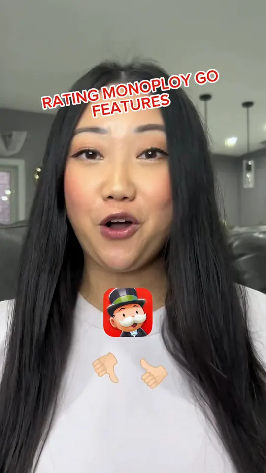
Reviews work especially well for games and apps people already have opinions about. For Monopoly GO!, I rated features of the game one by one, which gives viewers a clear structure to follow and a reason to stay until the end.
Show the real outcome
Viewers don't download features. They download outcomes. But the outcome has to be real and shown, not promised.
Good outcome moments for app ads:
- The calendar that went from chaos to organized, on screen.
- The finished result inside the app, like a completed budget view or a saved list.
- My genuine reaction the first time something works.
What I avoid: inventing a result I didn't get, or implying everyone will get the same one.
Keep claims compliant, especially for fintech
This is general guidance, not legal advice. Your legal team and the platform policies have the final word.
App ads have to follow the rules of the ad platform they run on, and some categories get extra scrutiny. Finance is the big one. TikTok's financial services ad policy, for example, prohibits get-rich-quick and too-good-to-be-true financial offers, and calls out misleading or exaggerated financial claims (TikTok Ads Policy: Financial Services).
For UGC for fintech apps, that means:
- Don't promise outcomes. "This app will save you money every month" is a promise. "I like seeing all my spending in one place" is an experience.
- No specific money results unless the brand has approved and substantiated them. If I show numbers, they're sample data you provide.
- Use the brand's approved claims and disclaimers. Send them with the brief and I'll work them into the script naturally.
- Match what the app actually does today. If a feature is coming soon, don't show it as live.
Make the CTA to download obvious
A strong ending is simple. Tell the viewer exactly what to do and why now:
- Say it out loud: "Download it, it's free to try" (only if it is).
- Show the app store page or app icon on screen.
- Match the CTA to the ad's promise. If the hook was about overwhelm, the CTA is about getting organized.
Keep it short. The download button on the ad does the heavy lifting.
Test hooks, not just videos
For apps, the hook is the biggest lever you have. I always suggest filming several hooks for the same body so you can test them against each other.
Ways I vary hooks for app ads:
- Problem-first: show the frustration before the app.
- Result-first: open on the finished outcome in the app.
- Reaction-first: my face reacting before you even see the screen.
- Skit-first: a quick scene that sets up the joke.
Extra hooks and raw footage are both add-ons in my packages, so your team can keep recutting winners. If you plan to run the videos from my handle as Spark Ads or through whitelisting, read my guide to UGC usage rights and whitelisting first.
Getting started
Here's what makes an app shoot smooth on my end:
- A brief with your audience, the one feature to focus on, and approved claims. My guide on how to write a UGC brief walks through it.
- A test account and any login details I need.
- Clarity on where the ads will run and for how long.
I'm trusted by 300+ brands, and you can see live stats verified by TrustUGC in my results, plus what other brands say in reviews. Compare The Single, The Trio and The Monthly, or read how much UGC costs first. Not sure if UGC or influencers fit your app better? I break that down in UGC vs influencer marketing.
Got an app that needs installs? Let's talk.